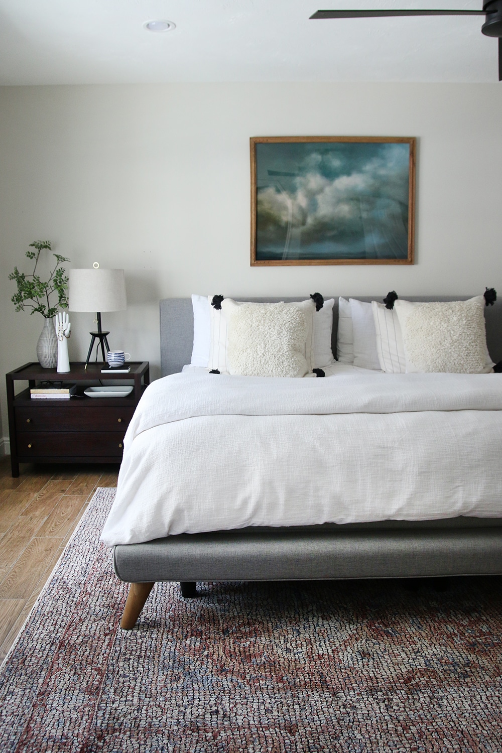
Master bedroom makeover before, inspiration, and plan: Week 1 of the One Room Challenge!
I'll be sharing updates with you every Thursday for the next 6 weeks, but this post is a meaty one--the "before" photos (a couple stages), my inspirations, my top two mood boards (feel free to weigh in, things are still in flux!), and plans for a big DIY project that will be part of the makeover!
One Room Challenge - Master Bedroom
As you know, our house is a bit of a fixer upper and we will be "redoing" every space in that everywhere needs paint at a minimum. And of course furniture and decor to our tastes. But our bedroom (the room we're currently using as the master, though we may move upstairs in a few years if Otto does) is really not decorated at all and it's getting a little depressing.
Goals for this project include making our bedroom feel like a project-free, peaceful retreat. It's been years since we had matching nightstands I liked, matching and adequately sized dressers, and appropriately placed art. Even in our last house when we got our master bedroom pretty much done, it felt hodgepodge to me.
Before
So, I'm not sure what the official rules are for what counts as a "before" pic, but I'll show you everything just in case.
Here is how the room looked when we moved in. We think the wallpaper was done in the 70's or 80's throughout the house, probably along with that light fixture and the Priscilla curtains. Then the previous owners added that massive brown closet thing, an IKEA unit. (See all the before photos of this house here.)
And the closet.
We've definitely made progress, but no real art on the walls (there was still a nail there and I hung that art there rather than leave it on the floor after the move), and just using leftover rug etc. we had before.
At one point we had the bassinet in here, and tried a couple different layouts... which was useful for helping me decide what size dressers (and even bed) we need.
This is how it has looked for most of the 3ish months we've been here. Yes, that is a baby quilt binder-clipped to the old roller shade hardware (shade was missing on that window). We did upgrade to some linen Roman shades and I'll share those soon--I shared a little on Instagram already.
Inspiration
I'm going for a mild "modern traditional" look in this house, but not on the rustic side. It's a 1937 house but I'm not into the frilly, ornate, and colorful pieces of that time... but I don't want to go completely against the look and do a California cool Amber Interiors-ey pale wood, boho thing. I can't, I mean, look at that warm woodwork!
I've also decided I want an upholstered bed (going for the super comfortable retreat I want). I really haven't seen any rooms that are close to what I want... partly because dark woodwork is not common and that's a strong design element of our room. But here are a few rooms I'm pulling inspiration from.
 |
| Source |
 |
| Source |
 |
| Source |
Yeah... those are all pretty different rooms. Like I said, there's no ONE or two inspirations! See the designs below for which pieces I'm pulling from these rooms!
Design
I have been thinking and overthinking this design for months now, even before we knew we had this house, so I could easily agonize over every single purchase now that it's time to actually pull the trigger. The fact that I've narrowed it down to basically two designs is incredible!! I should probably have only one set at this point, right? It has taken me so many hours just to get this far, though! I will just have to see how things look as they come in and decide as I design.
Option 1, I think...
Things that are set:
- The night stands. I decided a few months ago that these are the ultimate real wood, high tech, not-too-anything-style nightstands and I am sticking with them.
- The dressers. I wish we had room for a low, wide dresser plus a tall one but we just don't. I already ordered these and the next day, they were out of stock! They are also real wood and were $799 originally but I got them for $170 each on clearance. Calling it a score and a sign and moving on.
Things that are in flux:
- Color/fabric for the bed. I need to go to the fabric store ASAP and get some swatches, then compare with the rug, then... eventually decide.
- Art. I am usually a big fan of art over the bed, but because we have that off-center window, I've entertained the idea of big art behind the lamp on the other side. If I find something vertical that I love, I might go with that instead!
- All of the differences between these boards!
Things that I haven't decided at all yet:
- Curtains. Or no curtains? My go-to is white curtains on this rod or this one, but... the roman shades-only look isn't bad. As you can see from the mood boards, I've just been leaving that a blank! I am leaning toward curtains on the double-window wall only.
- Art above the dressers. Right now my dresser just has my messy jewelry storage on it (that will also get an upgrade as part of this project!).
- Decorative bedding. I think this may change seasonally but for now I want a few new cozy throw pillows that are perfect for a bedroom!
Would love to hear what you think of the designs and differences!
Follow along to see what the Featured Designers and other Guest Participants are doing for the ORC too!


No comments
Post a Comment